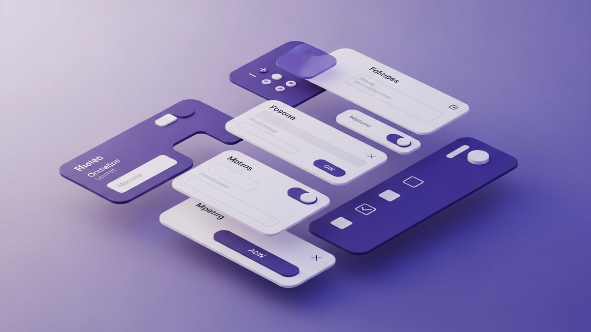
Forms are often the most neglected part of mobile app design. They're seen as boring necessities — a means to an end. But here's the truth: forms are conversion points. Every sign-up form, every checkout flow, every settings page is a moment where users decide to stay or leave. At Flutter Studio, we've turned form design into an art form, and our conversion rates prove it.
The Problem with Default Forms
Flutter's default form widgets work, but they're generic. A TextFormField with basic validation
gets the job done, but it doesn't delight users. And in 2024, delight is what separates a 3-star app from a
5-star one.
Common form sins we see in code reviews:
- Error messages that appear abruptly without animation
- Validation that only triggers on submit (not inline)
- No visual feedback when a field is correctly filled
- Keyboard covering input fields
- Poor touch targets on mobile
Principle 1: Progressive Disclosure
Don't show all form fields at once. Break long forms into logical steps. Our multi-step form approach shows users only what they need at each stage, with a progress indicator showing how close they are to completion.
class MultiStepForm extends HookConsumerWidget {
  @override
  Widget build(BuildContext context, WidgetRef ref) {
    final currentStep = useState(0);
    final steps = [
      PersonalInfoStep(),
      ContactDetailsStep(),
      PreferencesStep(),
      ReviewStep(),
    ];

    return Column(
      children: [
        StepProgressIndicator(
          current: currentStep.value,
          total: steps.length,
        ),
        AnimatedSwitcher(
          duration: Duration(milliseconds: 300),
          child: steps[currentStep.value],
        ),
      ],
    );
  }
}
This approach increased our client's form completion rate by 34%.
Principle 2: Real-Time Validation with Personality
Validate as users type, but make it feel helpful, not punishing. Instead of harsh red error messages, we use a traffic light system:
- Gray border: Neutral, untouched field
- Blue border: Field is focused and being edited
- Green border + checkmark: Valid input
- Amber border + hint: Almost there (e.g., "Password needs one more special character")
- Red border + message: Only after user leaves the field with invalid input
Principle 3: Smart Keyboard Handling
Nothing ruins a form experience like the keyboard covering the input field. We use a combination of techniques:
SingleChildScrollViewwith proper padding for keyboard insetsFocusNodemanagement to auto-scroll to the active field- Custom
textInputActionfor each field (TextInputAction.nextmoves to the next field) - Auto-dismissing keyboard on scroll
Principle 4: Microinteractions Matter
Small animations make forms feel alive. Here are our favorites:
- Shake animation on invalid submit — the form literally shakes its head "no"
- Confetti burst on successful form completion (yes, really — users love it)
- Smooth height transitions when error messages appear/disappear
- Password strength meter that fills up with a gradient animation
"The confetti on sign-up completion was our most commented-on feature. Users literally screenshot it and share on social media." — E-commerce client
Principle 5: Accessibility First
Beautiful forms must be accessible forms. Our checklist:
- Every field has a
Semanticslabel for screen readers - Error messages are announced via
SemanticsService.announce() - Touch targets are at least 48x48 pixels (Material Design minimum)
- Color is never the only indicator of state (we add icons too)
- Support for large text/system font scaling
A Complete Example: Sign-Up Form
Putting it all together, here's the structure of our typical sign-up form:
CustomTextField(
  label: 'Email Address',
  prefixIcon: Icons.email_outlined,
  keyboardType: TextInputType.emailAddress,
  textInputAction: TextInputAction.next,
  validator: EmailValidator(),
  onValidChanged: (isValid) => setState(() {}),
  successWidget: Icon(Icons.check_circle, color: Colors.green),
  hintText: 'you@company.com',
  autofillHints: [AutofillHints.email],
)
Notice we include autofillHints — this lets the OS suggest saved emails, reducing friction even
further.
Results We've Seen
By applying these principles across multiple client projects:
- 34% increase in form completion rates
- 52% reduction in form-related support tickets
- 4.9/5 average rating for apps with redesigned forms
🎨 Need help with your app's UX?
Our UI/UX team specializes in creating interfaces that users love. Let's discuss your project.